Introduction
The design of brochures has changed a lot over the years. It used to be that they were simply glorified ads for any given company or product. But now, with increased competition and technological advancements, people have started to expect more from their brochures. The need for an engaging and eye-catching experience has become much more important than ever before when it comes to marketing your business through a brochure design. So what are some of the trends we’re seeing in this industry right now?
Using white space creatively
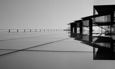
White space is an important part of the design. It can help to create a sense of order, calmness and elegance. White space can also be used to draw attention to certain parts of your brochure. According to Sergio Lisciani from DesignMantic, “White space is an important part of any design that you’re creating.”
Bright colours, pastels and neon colours
Bright colours, pastels and neon colours are what we can call the new trends in brochure design.
Let’s see how these can be used in your next project:
• They are great for attracting attention to your brand or product. Many times we see different types of advertising, but they all have one thing in common: they use bright colour palettes because they know that people remember them better than others. Your brochure will be no exception to this rule!
• They have a youthful energy that makes people feel happy when they look at it. You don’t want to give off an image of being old-fashioned with your designs; instead, you should try something fun and fresh!
There are many ways you can incorporate these ideas into your project: by using neon typography on top of a black background or pastel paper for example (or both!).
Video brochures
Video brochures are another trend to consider. You can use video brochures to tell a story or show off products and services. They’re perfect for social media marketing and can also be used on your website.
Video brochures are like mini-movies that allow you to capture the attention of your audience by making them feel as if they’re actually there experiencing everything with you.
For more on brochure design check out this fantastic article on Flux Academy: The Importance Of White Space in Design (With Examples)
Conclusion
There are many options when it comes to brochure design. But these trends show that you can still get noticed by using a combination of classic designs with modern approaches. You don’t have to go with the crowd or follow every trend out there in order to create something unique; all it takes is some creativity and good taste.
If you need help creating an inspired brochure, or would like to use our high-quality printing services, please contact our team at PrintUK.com


.jpg)
.jpg)
